

How to create complex shapes using clip-path in CSS?
Yes, you can create these all shapes using clip-path in CSS.

Software Developer who shares content on software engineering, careers, and technical writing.
There and many properties that are used to create this shape but we are going to create all these shapes using the 𝗽𝗼𝗹𝘆𝗴𝗼𝗻( ) function in the clip-path.
Syntax of the polygon function: clip-path: 𝗽𝗼𝗹𝘆𝗴𝗼𝗻( x y, x y, x y, ...);
NOTE:
x and y together form a point.
x and y are the values of x and y coordinates.
let's create these shapes👇
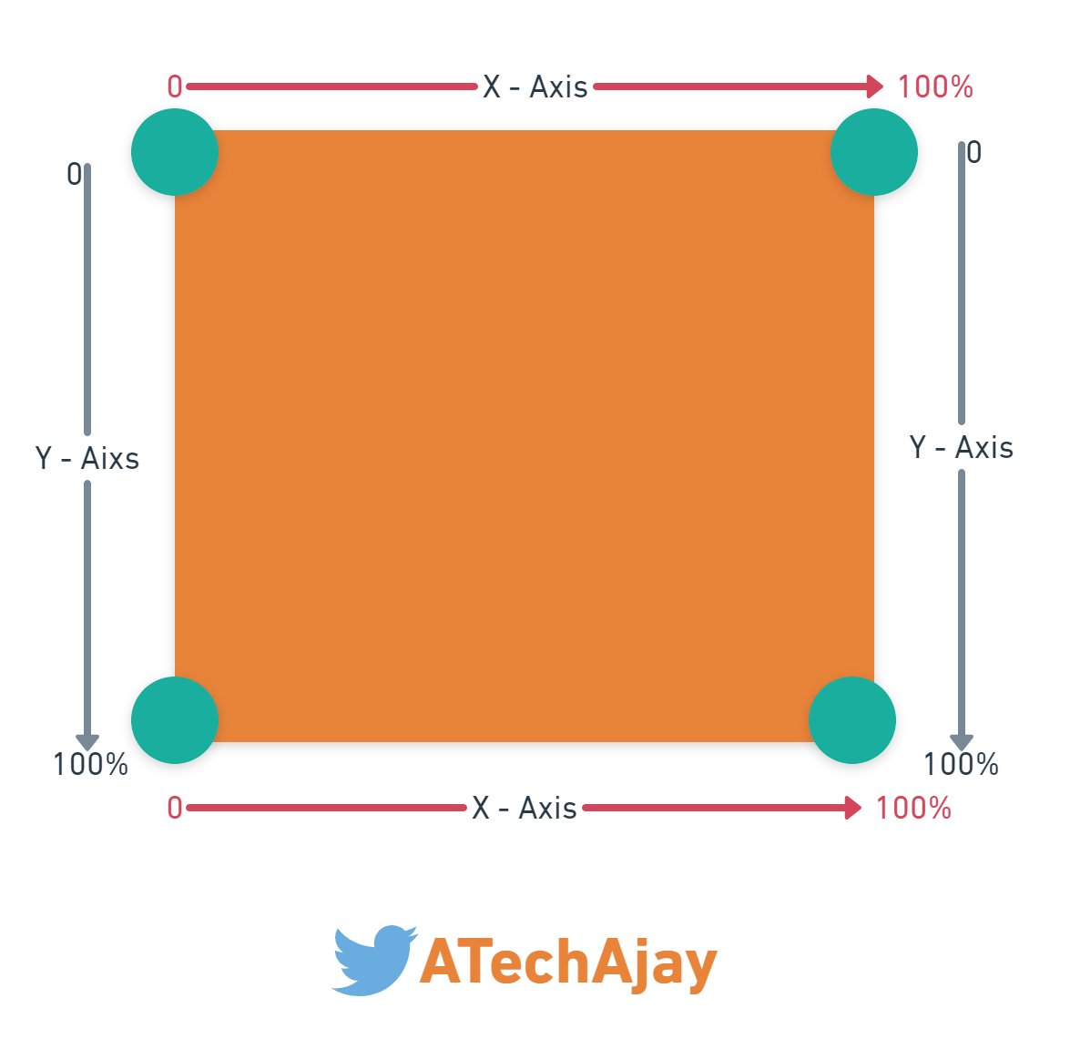
Suppose this is the container in which we are going to draw our shape using the clip-path.
In this container, there are 4 corners or points.
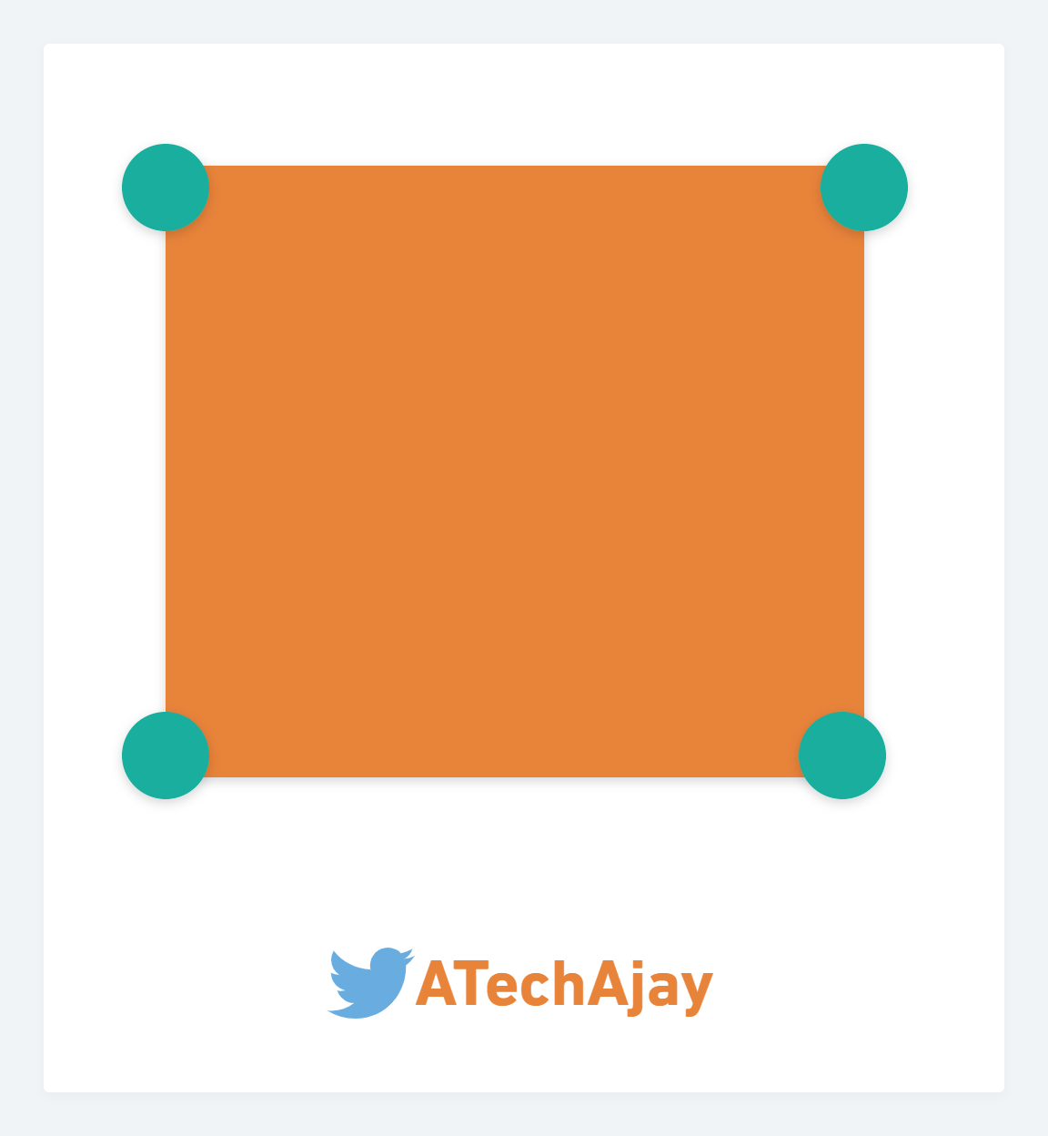
So now we have to specify the coordinates of each corner or point of the container.
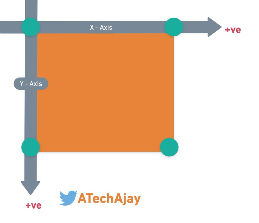
We will always measure the distance for a point from the top left corner point.
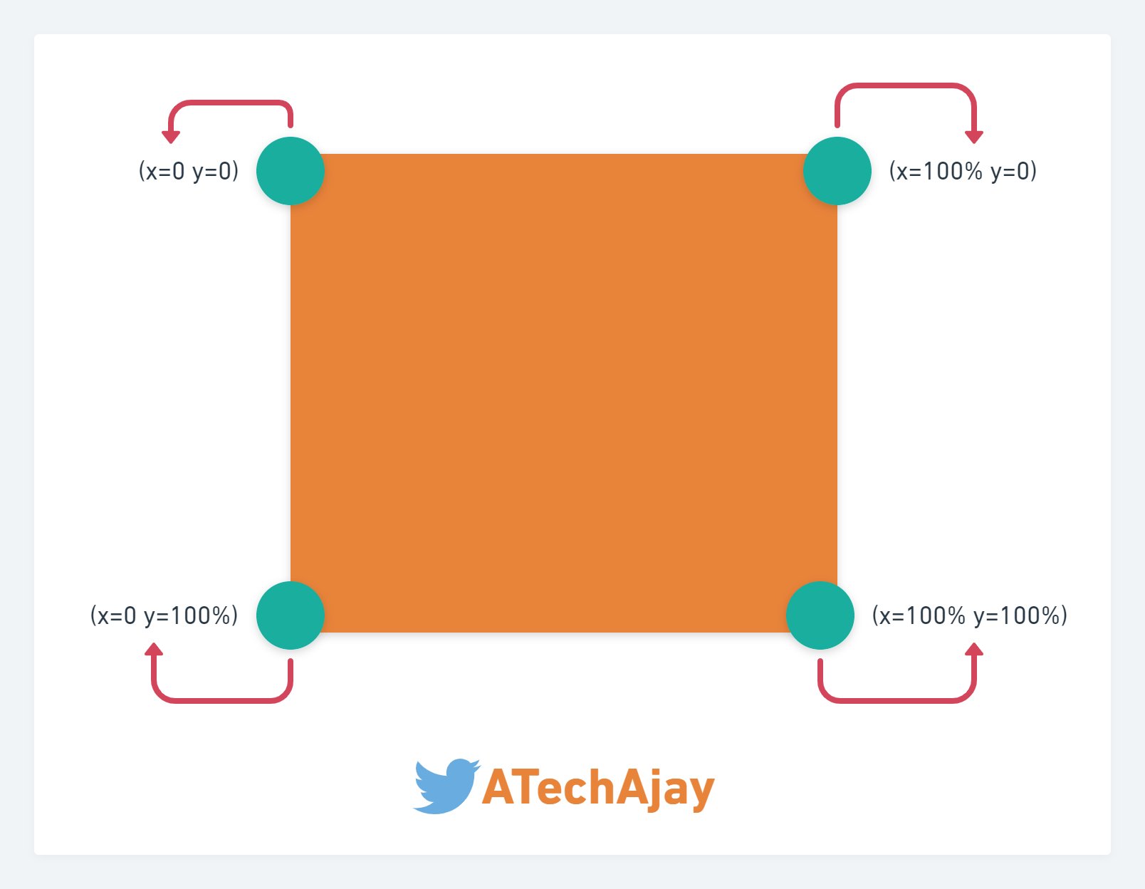
Now, we have to find the coordinates of the points. The coordinate of this point is (0 0) which means x=0% and y=0%
And this is the axis of the container in which we are going to create our shape.
In this image, you can see, that there are 4 points displayed here.
top left point
top right point
bottom left point
bottom right point
Now we have to find the coordinates of these all 4 points.
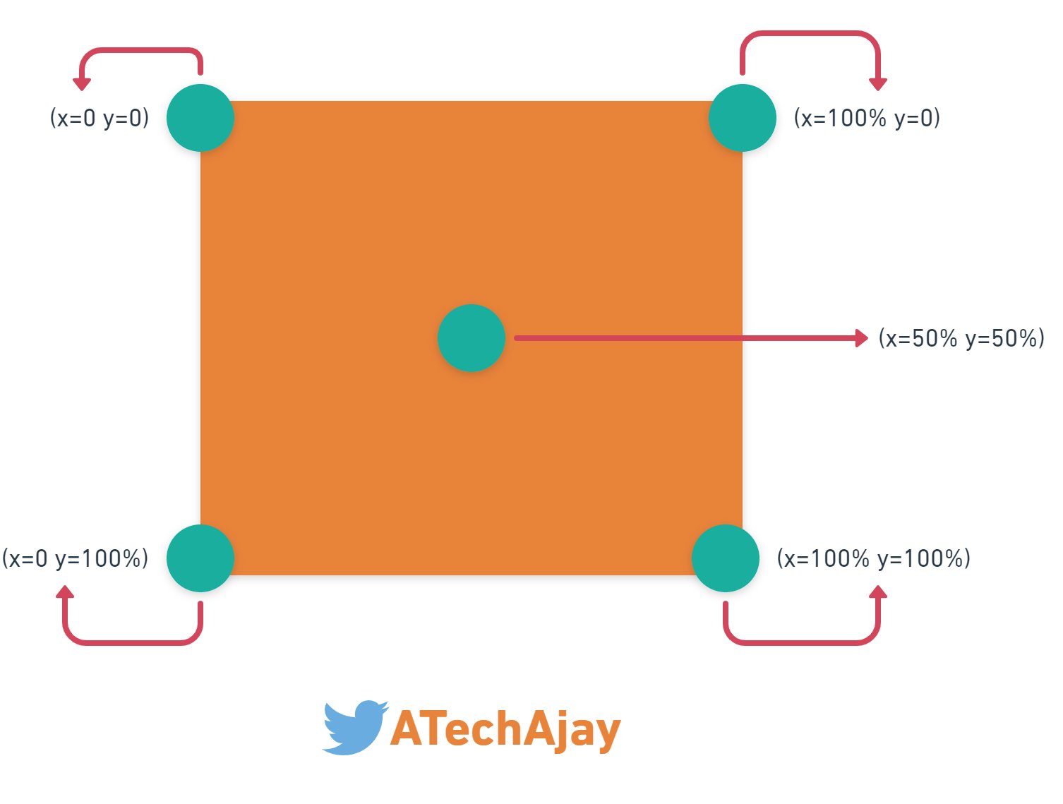
top left point → x = 0%, y = 0%
top right point → x = 100%, y = 0%
bottom left point → x = 0%, y = 100%
bottom right point → x = 100%, y = 100%
We can also omit the percent(%) sign from 0.
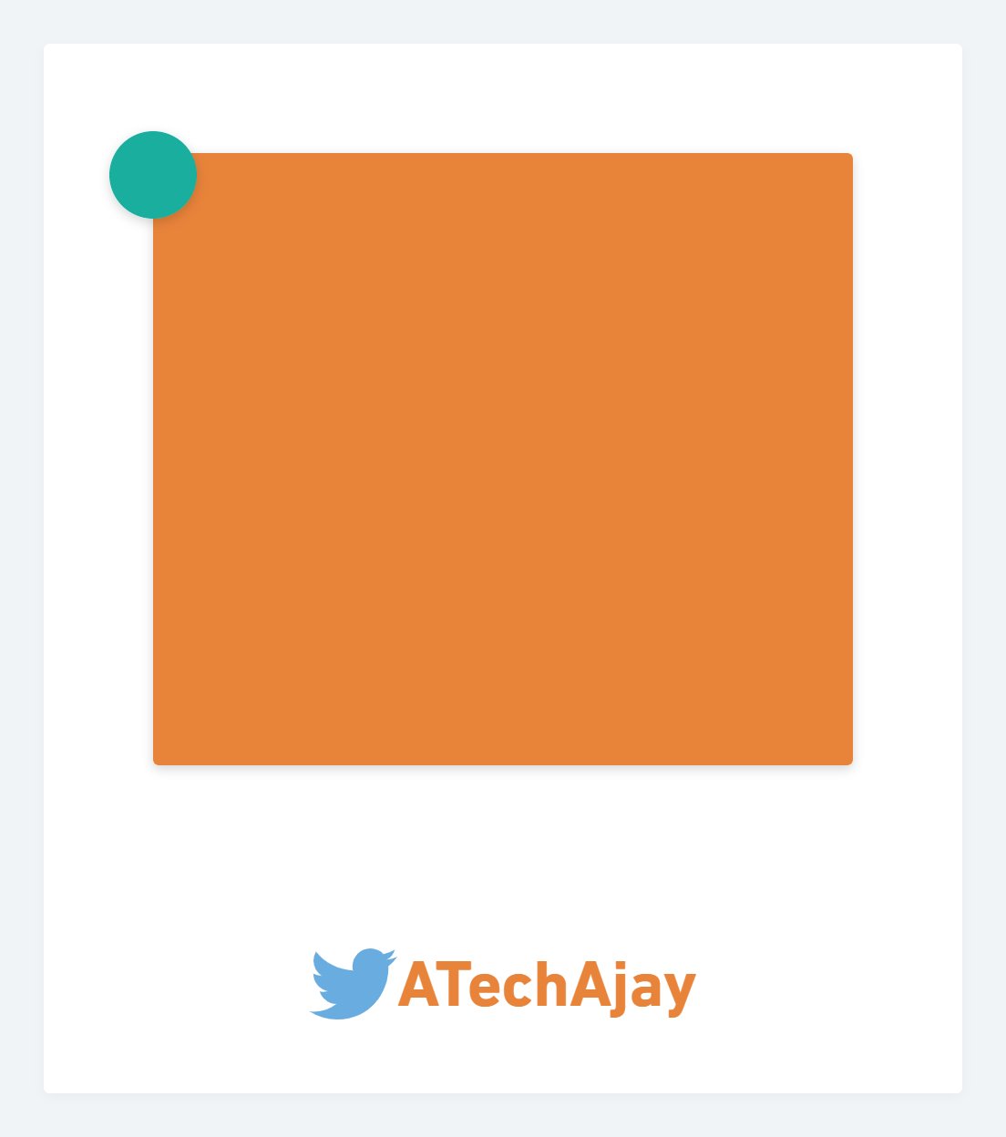
Also, we can put points anywhere in this container, such as the middle point.
So, here the value of x and y = 50%
Now we are going to create a triangle shape, but you can create any shape using this technique.
To create a shape, first of all, we have to highlight the point of the desired shape.

Now we have to do numbering those points serial-wise, either clockwise or anti-clockwise.
I have numbered these points clockwise.
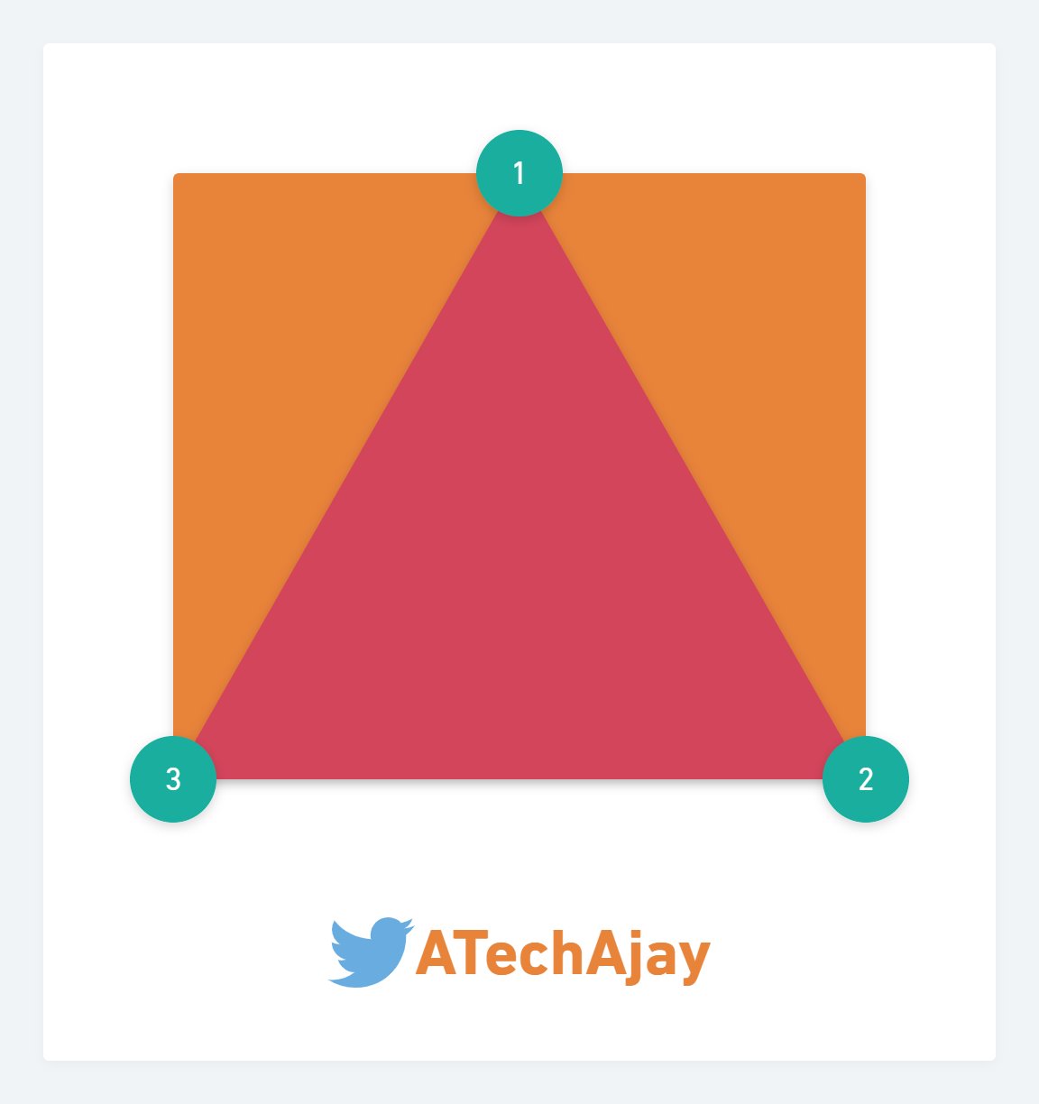
Now all those points we have to write serial-wise(either clockwise or anti-clockwise) in CSS otherwise, your shape will not be drawn as per your requirement.
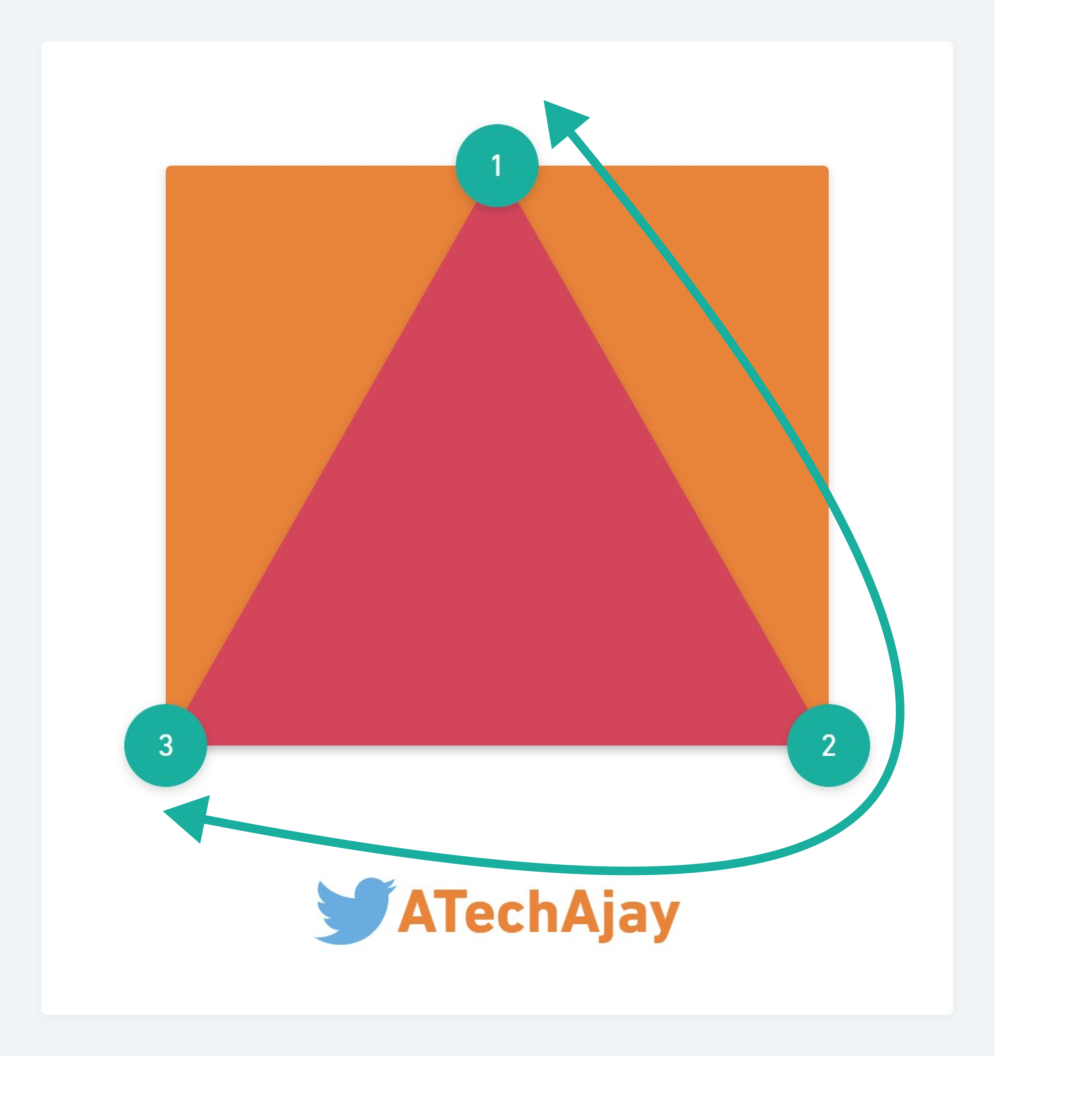
After that, we have to measure those points from the top-left point of the container.
- point number 1 → x = 50%, y = 0%
- point number 2 → x = 100%, y = 100%
- point number 2 → x = 0%, y = 100%
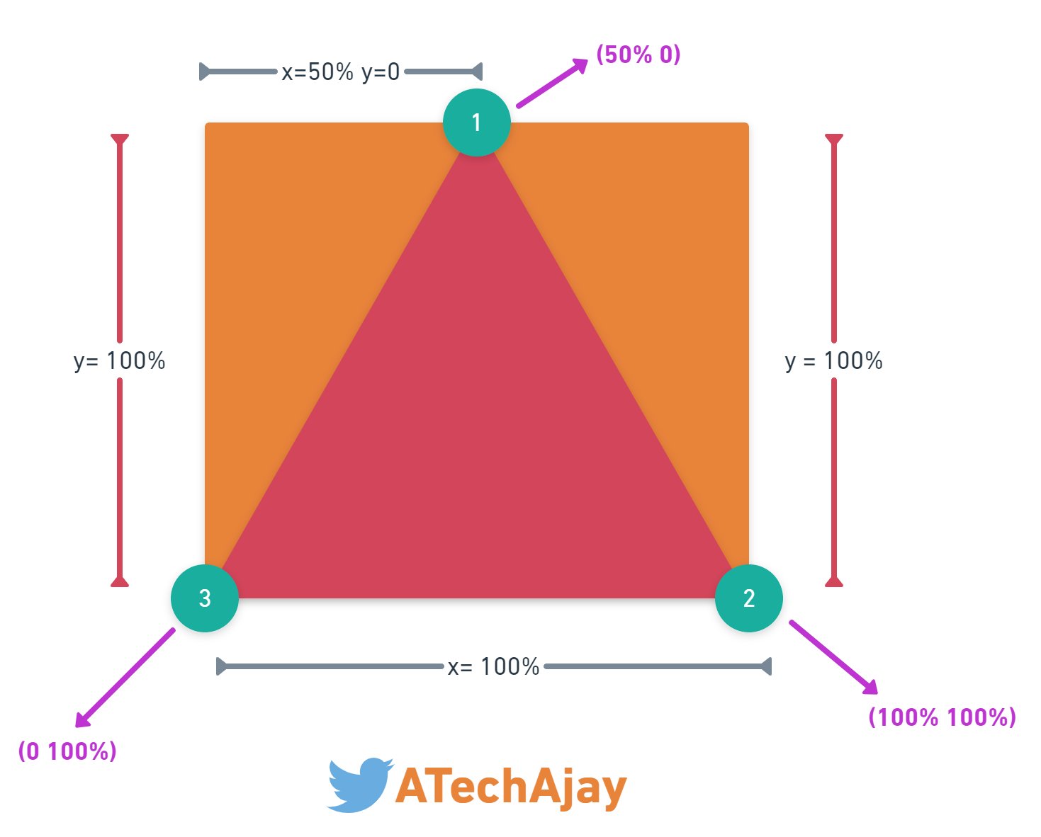
So finally, this is the clip-path value that is used to create a triangle shape.
clip-path: polygon(50% 0, 100% 100%, 0 100%);
👀 Here is the codepen link for this shape.


